20 Many models
20.1 gapminder
对gapminder这个数据表进行分析一下。
# 载入数据包
library(gapminder)
gapminder
#> # A tibble: 1,704 x 6
#>   country     continent  year lifeExp      pop gdpPercap
#>   <fct>       <fct>     <int>   <dbl>    <int>     <dbl>
#> 1 Afghanistan Asia       1952    28.8  8425333      779.
#> 2 Afghanistan Asia       1957    30.3  9240934      821.
#> 3 Afghanistan Asia       1962    32.0 10267083      853.
#> 4 Afghanistan Asia       1967    34.0 11537966      836.
#> 5 Afghanistan Asia       1972    36.1 13079460      740.
#> 6 Afghanistan Asia       1977    38.4 14880372      786.
#> # ... with 1,698 more rows
20.1.1 初识数据
str(gapminder)
#> tibble [1,704 x 6] (S3: tbl_df/tbl/data.frame)
#>  $ country  : Factor w/ 142 levels "Afghanistan",..: 1 1 1 1 1 1 1 1 1 1 ...
#>  $ continent: Factor w/ 5 levels "Africa","Americas",..: 3 3 3 3 3 3 3 3 3 3 ...
#>  $ year     : int [1:1704] 1952 1957 1962 1967 1972 1977 1982 1987 1992 1997 ...
#>  $ lifeExp  : num [1:1704] 28.8 30.3 32 34 36.1 ...
#>  $ pop      : int [1:1704] 8425333 9240934 10267083 11537966 13079460 14880372 12881816 13867957 16317921 22227415 ...
#> $ gdpPercap: num [1:1704] 779 821 853 836 740 ...数据包括各国预期寿命,人均GDP和人口数据的摘录。各个字段含义如下:
country:国家。因子变量,142个水平。
continent:国家所属大洲。因子变量,5个水平。
year:年份。1952-2007,每5年一个记录。
lifeExp:预期寿命。
pop:人口数。
gdpPercap:人均国内生产总值。
20.1.2 案例研究
问题:每个国家(country)的预期寿命(lifeExp)是如何随时间(year)变化的?
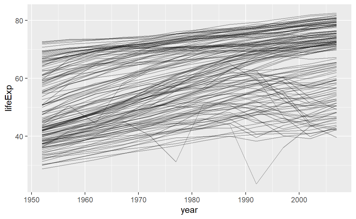
可以看到,总的来说,预期寿命似乎一直在稳步提高。然而,如果仔细观察,我们可能会注意到一些国家没有遵循这种模式。为了使这些国家更容易被看到,我们可以使用线性趋势拟合模型,解释模型随时间稳定的部分,再从残差中研究剩余的部分。
对于某一个国家,这样的工作并不困难。
nz <- filter(gapminder, country == "China")
nz %>%
ggplot(aes(year, lifeExp)) +
geom_line() +
ggtitle("Full data = ")
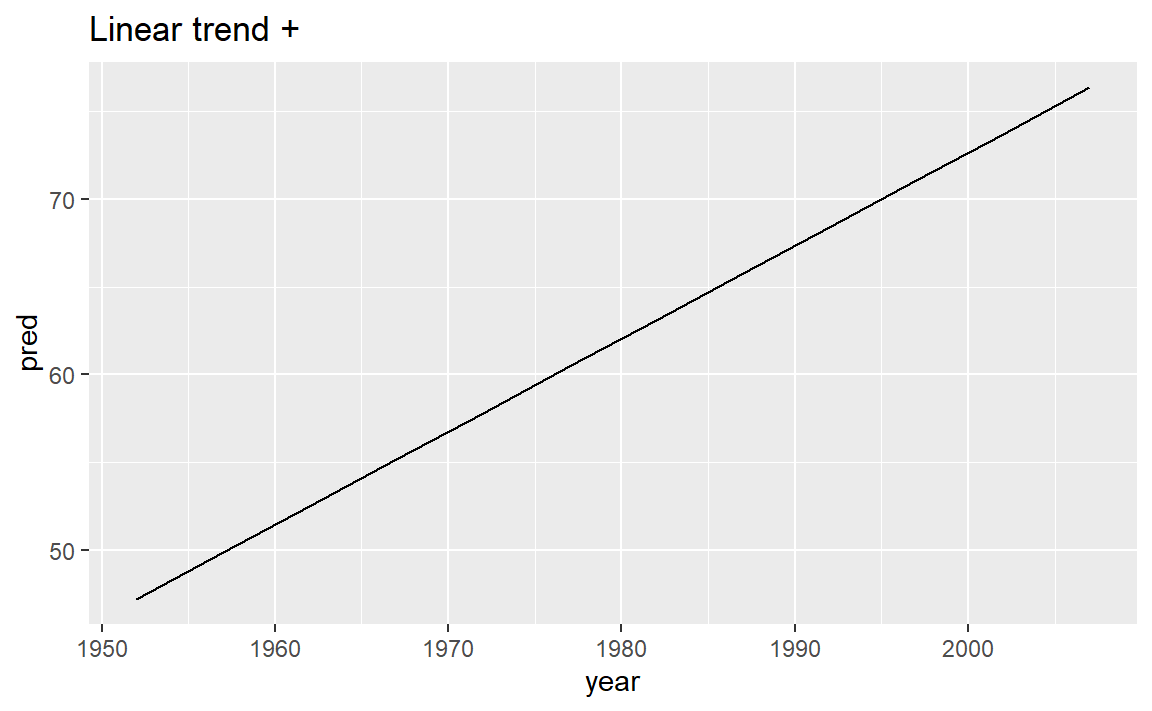
nz_mod <- lm(lifeExp ~ year, data = nz)
nz %>%
add_predictions(nz_mod) %>%
ggplot(aes(year, pred)) +
geom_line() +
ggtitle("Linear trend + ")
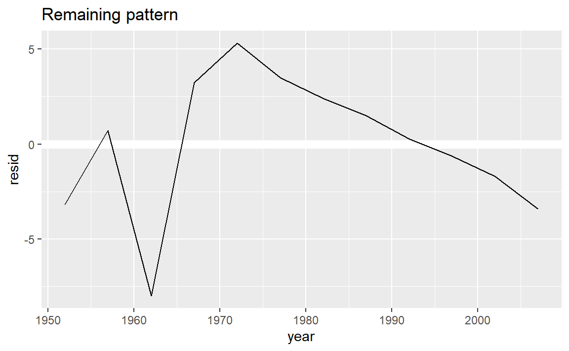
nz %>%
add_residuals(nz_mod) %>%
ggplot(aes(year, resid)) +
geom_hline(yintercept = 0, colour = "white", size = 3) +
geom_line() +
ggtitle("Remaining pattern")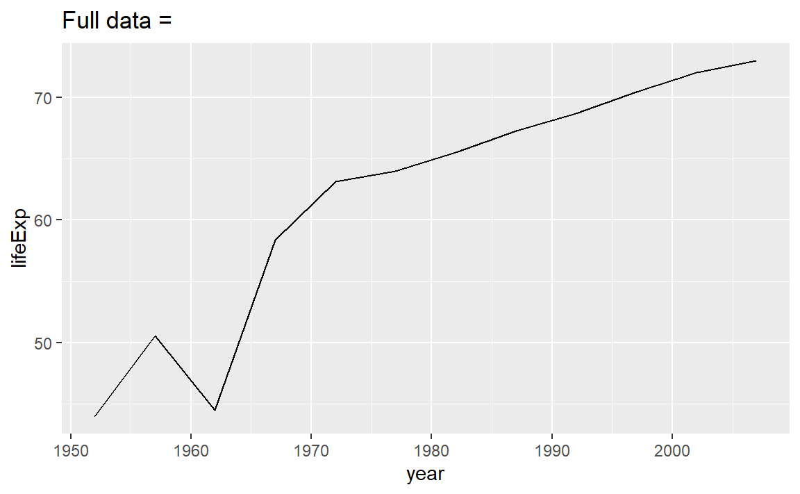
对于多个国家,我们可以使用purrr的map函数,但我们需要先构建每个国家的嵌套数据框。
by_country <- gapminder %>%
  group_by(country, continent) %>%
  nest()
head(by_country)
#> # A tibble: 6 x 3
#> # Groups:   country, continent [6]
#>   country     continent data
#>   <fct>       <fct>     <list>
#> 1 Afghanistan Asia      <tibble [12 x 4]>
#> 2 Albania     Europe    <tibble [12 x 4]>
#> 3 Algeria     Africa    <tibble [12 x 4]>
#> 4 Angola      Africa    <tibble [12 x 4]>
#> 5 Argentina   Americas  <tibble [12 x 4]>
#> 6 Australia Oceania <tibble [12 x 4]>这是一个嵌套数据框,它的data列是一列数据框。
这时可以对每个国家拟合模型了:
country_model <- function(df) {
  lm(lifeExp ~ year, data = df)
}
by_country <- by_country %>%
  mutate(model = map(data, country_model))
再对于每个模型添加残差:
by_country <- by_country %>%
  mutate(
    resids = map2(data, model, add_residuals)
  )
by_country
#> # A tibble: 142 x 5
#> # Groups:   country, continent [142]
#>   country     continent data              model  resids
#>   <fct>       <fct>     <list>            <list> <list>
#> 1 Afghanistan Asia      <tibble [12 x 4]> <lm>   <tibble [12 x 5]>
#> 2 Albania     Europe    <tibble [12 x 4]> <lm>   <tibble [12 x 5]>
#> 3 Algeria     Africa    <tibble [12 x 4]> <lm>   <tibble [12 x 5]>
#> 4 Angola      Africa    <tibble [12 x 4]> <lm>   <tibble [12 x 5]>
#> 5 Argentina   Americas  <tibble [12 x 4]> <lm>   <tibble [12 x 5]>
#> 6 Australia   Oceania   <tibble [12 x 4]> <lm>   <tibble [12 x 5]>
#> # ... with 136 more rows
嵌套数据框好处理,但要展示出来还得解除嵌套(unnest):
resids <- unnest(by_country, resids)
resids
#> # A tibble: 1,704 x 9
#> # Groups:   country, continent [142]
#>   country    continent data        model  year lifeExp     pop gdpPercap   resid
#>   <fct>      <fct>     <list>      <lis> <int>   <dbl>   <int>     <dbl>   <dbl>
#> 1 Afghanist~ Asia      <tibble [1~ <lm>   1952    28.8  8.43e6      779. -1.11
#> 2 Afghanist~ Asia      <tibble [1~ <lm>   1957    30.3  9.24e6      821. -0.952
#> 3 Afghanist~ Asia      <tibble [1~ <lm>   1962    32.0  1.03e7      853. -0.664
#> 4 Afghanist~ Asia      <tibble [1~ <lm>   1967    34.0  1.15e7      836. -0.0172
#> 5 Afghanist~ Asia      <tibble [1~ <lm>   1972    36.1  1.31e7      740.  0.674
#> 6 Afghanist~ Asia      <tibble [1~ <lm>   1977    38.4  1.49e7      786.  1.65
#> # ... with 1,698 more rows
绘制各个国家的年份-预期寿命残差图:
resids %>%
  ggplot(aes(year, resid)) +
    geom_line(aes(group = country), alpha = 1 / 3) +
    geom_smooth(se = FALSE)
#> `geom_smooth()` using method = 'gam' and formula 'y ~ s(x, bs = "cs")'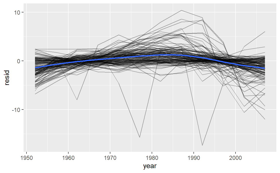
或者对大洲进行分面绘制:
resids %>%
  ggplot(aes(year, resid, group = country)) +
    geom_line(alpha = 1 / 3) +
    facet_wrap(~continent)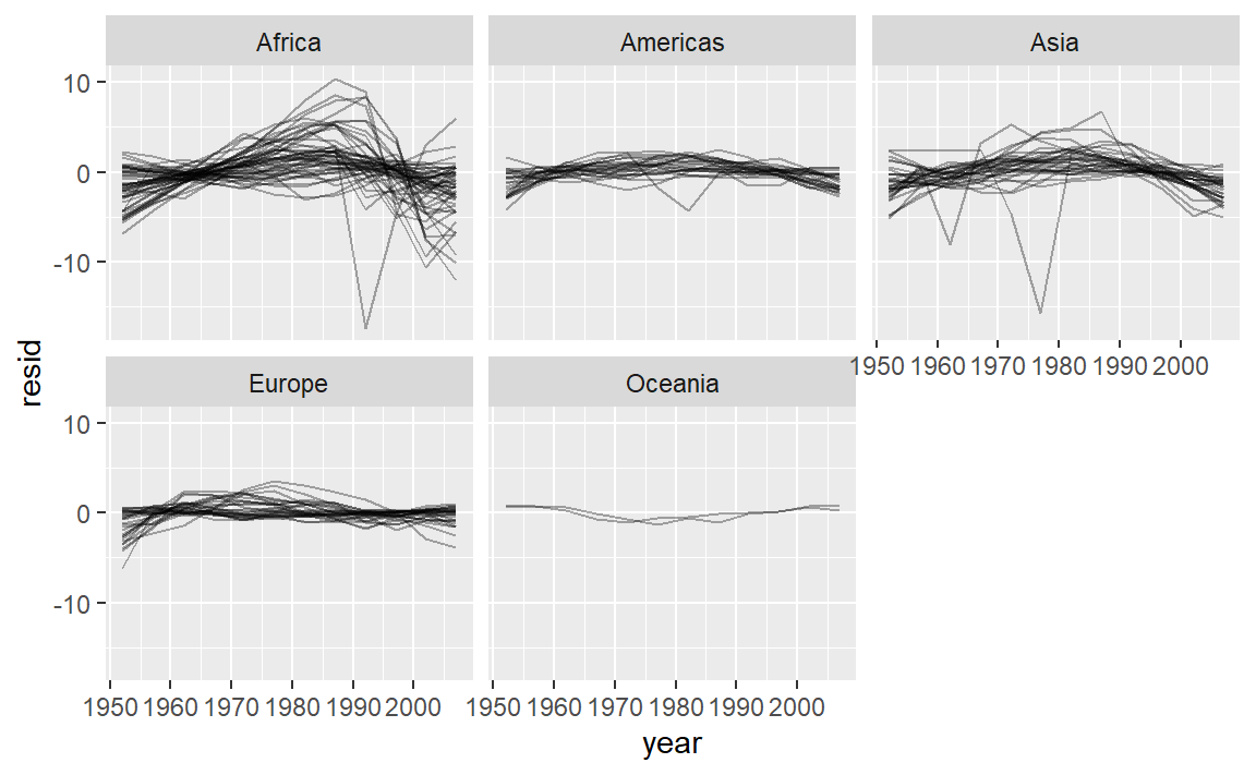
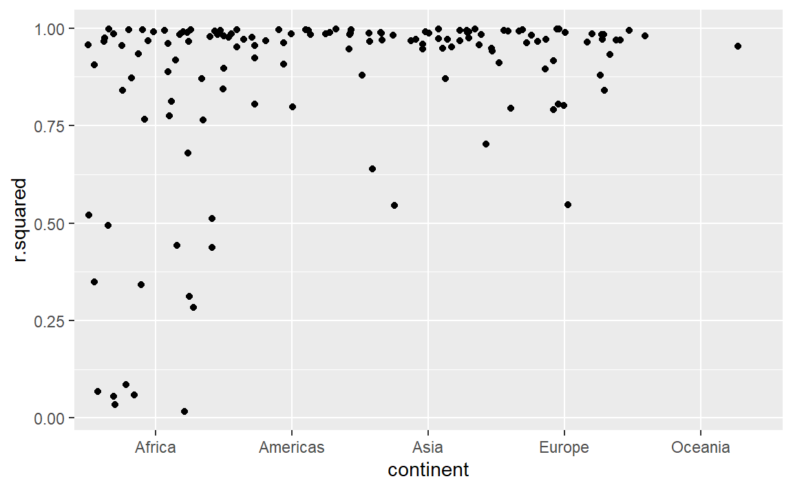
除了残差,还有很多指标可以衡量模型,可以使用broom::glance()去得到:
一般我们可以通过R平方去衡量模型解释的好坏,通过对R平方排序找出拟合不好的模型:
glance %>%
  arrange(r.squared)
#> # A tibble: 142 x 17
#> # Groups:   country, continent [142]
#>   country continent data  model resids r.squared adj.r.squared sigma statistic
#>   <fct>   <fct>     <lis> <lis> <list>     <dbl>         <dbl> <dbl>     <dbl>
#> 1 Rwanda  Africa    <tib~ <lm>  <tibb~    0.0172      -0.0811   6.56     0.175
#> 2 Botswa~ Africa    <tib~ <lm>  <tibb~    0.0340      -0.0626   6.11     0.352
#> 3 Zimbab~ Africa    <tib~ <lm>  <tibb~    0.0562      -0.0381   7.21     0.596
#> 4 Zambia  Africa    <tib~ <lm>  <tibb~    0.0598      -0.0342   4.53     0.636
#> 5 Swazil~ Africa    <tib~ <lm>  <tibb~    0.0682      -0.0250   6.64     0.732
#> 6 Lesotho Africa    <tib~ <lm>  <tibb~    0.0849      -0.00666  5.93     0.927
#> # ... with 136 more rows, and 8 more variables: p.value <dbl>, df <dbl>,
#> #   logLik <dbl>, AIC <dbl>, BIC <dbl>, deviance <dbl>, df.residual <int>,
#> #   nobs <int>
一些比较差的模型似乎都在非洲:
或者我们可以把拟合效果最差的一些模型筛选出来,并绘制它们的年份-预期寿命图像:
bad_fit <- filter(glance, r.squared < 0.25)

gapminder %>%
  semi_join(bad_fit, by = "country") %>%   # 筛选连接,保留匹配
  ggplot(aes(year, lifeExp, colour = country)) +
    geom_line()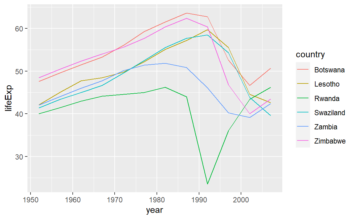
影响因素主要是艾滋病与种族灭绝。
20.2 思维导图